# new Component(config)
Parameters:
| Name | Type | Attributes | Description |
|---|---|---|---|
config |
object
|
||
id |
string
|
<optional> |
id of the component. Will be auto-generated if not set |
hidden |
boolean
|
<optional> |
true if the component is hidden when rendered for the 1st time |
target |
string
|
HTMLElement
|
<optional> |
DOM target insertion point. Either a DOM element or a CSS selector. |
methods |
object
|
<optional> |
Custom methods of the component |
events |
object
|
<optional> |
W3C events handled by the component |
subscriptions |
object
|
<optional> |
Array of functions registered in the PubSub |
collections |
Array.<Collection>
|
<optional> |
List of collections bound to the compoent. Component will reload if a mutation occurs in one of its bound collections. |
tip |
string
|
object
|
<optional> |
hover help message |
animation |
string
|
object
|
<optional> |
Animation to perform when rendering for the 1st time |
autoSize |
boolean
|
<optional> |
If true, the component will trigger its "updateLayout" method when its parent container is resized |
this
Methods
# _setBottom()
# _setHeight()
# _setLeft()
# _setMaxHeight()
# _setMaxWidth()
# _setMinHeight()
# _setMinWidth()
# _setRight()
# _setWidth()
# attachTip(tipConfig)
Attach a tip text to the component
TODO: At the moment, attaching a tip prevents from having other "onmouseenter" events. Don't overwrite onmouseenter event
Parameters:
| Name | Type | Attributes | Description |
|---|---|---|---|
tipConfig |
object
|
text
|
Config object {text: ..., deltaX: ..., deltaY: ...}, or a simple string |
|
text |
string
|
Tip text |
|
textAlign |
string
|
<optional> |
Tip text alignment: "center", "right". Default "left" |
x |
number
|
<optional> |
Optional static x |
Y |
number
|
<optional> |
Optional static y |
deltaX |
number
|
<optional> |
Shift the tip on X coordinate |
deltaY |
number
|
<optional> |
Shift the tip on Y coordinate |
this
Example
// Using a configuration object
myField.attachTip({
 text: "Please enter your name",
 deltaX: 20,
 deltaY: 20
})

// Using a simple text
myField.attachTip("Please enter your name")
# disconnectedCallback()
# moveToViewport()
Move the component inside the visible viewport. This is useful for example to re-center a component so that it's entirely visible.
this
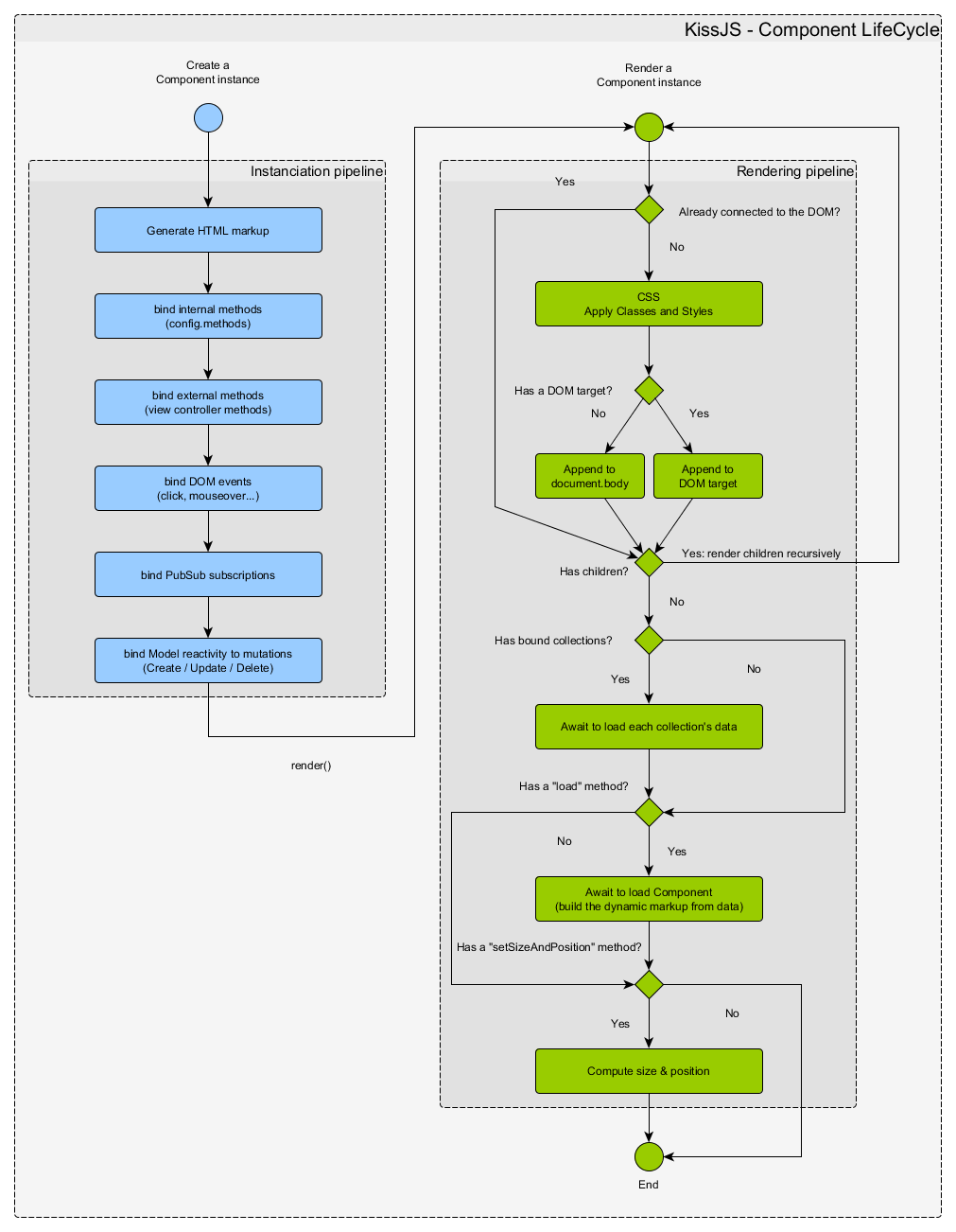
# render(targetopt, load)
Render an Element at a specified DOM location The rendering is optimized to render only the element that are detached from the DOM.
The render() method is chainable with other Component's methods. For example:
myElement.render().showAt(100, 100).setAnimation("shakeX")
Parameters:
| Name | Type | Attributes | Default | Description |
|---|---|---|---|---|
target |
*
|
<optional> |
optional DOM target insertion point |
|
load |
boolean
|
true | true (default) to execute the component's load method after DOM insertion |
this
# setAnimation(config)
Animate an HTMLElement.
- The animation must be set before rendering the component
- It's chainable, so it can be combined with render() and showAt()
Animation speed can be modified with the param "speed":
- slower
- slow
- fast
- faster
Animation repetition can be adjusted with the param "repeat":
- repeat-1
- repeat-2
- repeat-3
- infinite
Available animation names are:
- bounce
- flash
- pulse
- rubberBand
- shakeX
- shakeY
- headShake
- swing
- tada
- wobble
- jello
- heartBeat
- hinge
- jackInTheBox
- rollIn
- rollOut
- flipInX
- flipInY
- flipOutX
- flipOutY
- backInDown
- backInLeft
- backInRight
- backInUp
- backOutDown
- backOutLeft
- backOutRight
- backOutUp
- bounceIn
- bounceInDown
- bounceInLeft
- bounceInRight
- bounceInUp
- bounceOut
- bounceOutDown
- bounceOutLeft
- bounceOutRight
- bounceOutUp
- fadeIn
- fadeInDown
- fadeInDownBig
- fadeInLeft
- fadeInLeftBig
- fadeInRight
- fadeInRightBig
- fadeInUp
- fadeInUpBig
- fadeInTopLeft
- fadeInTopRight
- fadeInBottomLeft
- fadeInBottomRight
- fadeOut
- fadeOutDown
- fadeOutDownBig
- fadeOutLeft
- fadeOutLeftBig
- fadeOutRight
- fadeOutRightBig
- fadeOutUp
- fadeOutUpBig
- fadeOutTopLeft
- fadeOutTopRight
- fadeOutBottomLeft
- fadeOutBottomRight
- lightSpeedInRight
- lightSpeedInLeft
- lightSpeedOutRight
- lightSpeedOutLeft
- rotateIn
- rotateInDownLeft
- rotateInDownRight
- rotateInUpLeft
- rotateInUpRight
- rotateOut
- rotateOutDownLeft
- rotateOutDownRight
- rotateOutUpLeft
- rotateOutUpRight
- zoomIn
- zoomInDown
- zoomInLeft
- zoomInRight
- zoomInUp
- zoomOut
- zoomOutDown
- zoomOutLeft
- zoomOutRight
- zoomOutUp
- slideInDown
- slideInLeft
- slideInRight
- slideInUp
- slideOutDown
- slideOutLeft
- slideOutRight
- slideOutUp
Parameters:
| Name | Type | Attributes | Description |
|---|---|---|---|
config |
string
|
object
|
If the param is a string, it must be the animation name. Otherwise, it's a config like: {name: "zoomIn", speed: "fast", repeat: "repeat-3", callback: function() {...}}. Set the animation to false to remove the animation. |
|
name |
string
|
Animation name |
|
speed |
string
|
<optional> |
"slower" | "slow" | "fast" | "faster" |
repeat |
string
|
<optional> |
"repeat-1" | "repeat-2" | "repeat-3" | "infinite" |
callback |
function
|
<optional> |
Function to execute when the animation ends |
this - The component
Example
// Using only the animation name:
myComponent.setAnimation("fadeIn").render().showAt(100,100)

// Using a config object:
myComponent.setAnimation({
     name: "tada",
     speed: "fast",
     repeat: "repeat-1",
     callback: function() {
         this.hide()
     }
})

// Remove the animation
myComponent.setAnimation(false)
# setLeft(newLeft)
Set the component's left position
Parameters:
| Name | Type | Description |
|---|---|---|
newLeft |
string
|
function
|
Any CSS valid size, or a function returning a size |
this
# setSize(config)
Set the component's size
Parameters:
| Name | Type | Attributes | Description |
|---|---|---|---|
config.width |
object
|
<optional> |
Any CSS valid size, or a number (will be converted to pixels) |
config.height |
object
|
<optional> |
Any CSS valid size, or a number (will be converted to pixels) |
config |
this
Example
myComponent.setSize({width: "10vw"})
myComponent.setSize({height: "100px"})
myComponent.setSize({width: 300, height: "20%"})
# setTop(newTop)
Set the component's top position
Parameters:
| Name | Type | Description |
|---|---|---|
newTop |
string
|
function
|
Any CSS valid size, or a function returning a size |
this
# show(modeopt)
Display the component
Parameters:
| Name | Type | Attributes | Description |
|---|---|---|---|
mode |
string
|
<optional> |
Force a display mode. Ex: block, flex, inline, inline-block, inline-flex |
this
# showAt(x, y, animationTimeInSecondsopt)
Show the component at a specified (x, y) position on the screen. If the component leaks outside the viewport, it's re-centered to fit in.
Parameters:
| Name | Type | Attributes | Description |
|---|---|---|---|
x |
number
|
Coord x in pixels |
|
y |
number
|
Coord y in pixels |
|
animationTimeInSeconds |
number
|
<optional> |
Optional parameter to animate the translation of the Element |
this
Example
// It wil take 2 seconds to translate to position 500,500:
myElement.showAt(500, 500, 2)
# showLoading(config)
Show a loading spinner over the Component. By default, the overlay has the size of the element.
Parameters:
| Name | Type | Description |
|---|---|---|
config |
object
|
|
fullscreen |
boolean
|
If true, the loading mask cover the full screen |
mask |
boolean
|
Set to false to hide the background overlay |
spinnerSize |
number
|
string
|
Size of the spinning symbol. If a number, it's in pixels. If a string, it's a CSS size. |
this
Example
myPanel.showLoading({spinnerSize: 32})# update(newConfig) → {object}
Update a component with a new config
- Internally, destroys the component and re-render it from its config.
- If the component was inside a parent container, it re-render it at the same position
- Attention: if the component received extra properties/methods/events outside it's default config, they will be lost
Parameters:
| Name | Type | Description |
|---|---|---|
newConfig |
object
|
The new KissJS component
object